
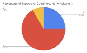
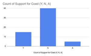
Through this process, I have learnt that I am not the best at dealing with data. The condensation of the information into a spreadsheet was not bad, however producing visuals based on the data was a bit difficult. We came across the problem that not all the data was numerical as there were some columns like “support for coeducation” that consisted of just “Y”, “N”, or “A” referring to yes, no or ambivalent in reference to whether they supported coeducation. We were able to produce two simple visuals using a pi chart and a bar graph. We had difficulty using google sheets to show anything more complex so both visuals show the support of coeducation among the data we had, as seen below.
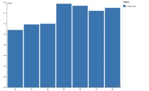
After attempting to explore with google sheets, we imported our data into “RAW Graphs” which we found to be much more user friendly. With this website, we were able to create a visual that incorporated more than one variable. The x-axis represents the decade that the alumni graduated W&L, while the y-axis represents the average number of pages written in their letter. I spent a while trying to figure out how to create axis titles and a title but was unsuccessful in finding where on the website I would be able to do this, so that would be something I need to look into more in the future. Overall, despite not being able to easily find these features, we were more successful at incorporating more than one variable into a visual when we used the website rather than google sheets.
I would not say I am a master at data but I do think if I play around with more data sets, I would become more comfortable with it. Also, while we did not think about data visceralization while we were creating these visuals since we were trying to keep it basic, I do think that there are ways that you could present the data to make it something more than just numbers. Coeducation is a topic that for many people evokes emotion so I think if you presented the data with certain colors or brought images into the visual itself, you may be able to make the data more meaningful. Just even through our pi chart, it became incredibly obvious how much the alumni were against coeducation. When you just read individual alumni letters you aren’t able to truly see how big the support was for keeping women out of W&L, but as soon as you combine these opinions into a visual you can clearly see that it was 66% of alumni that lacked support.